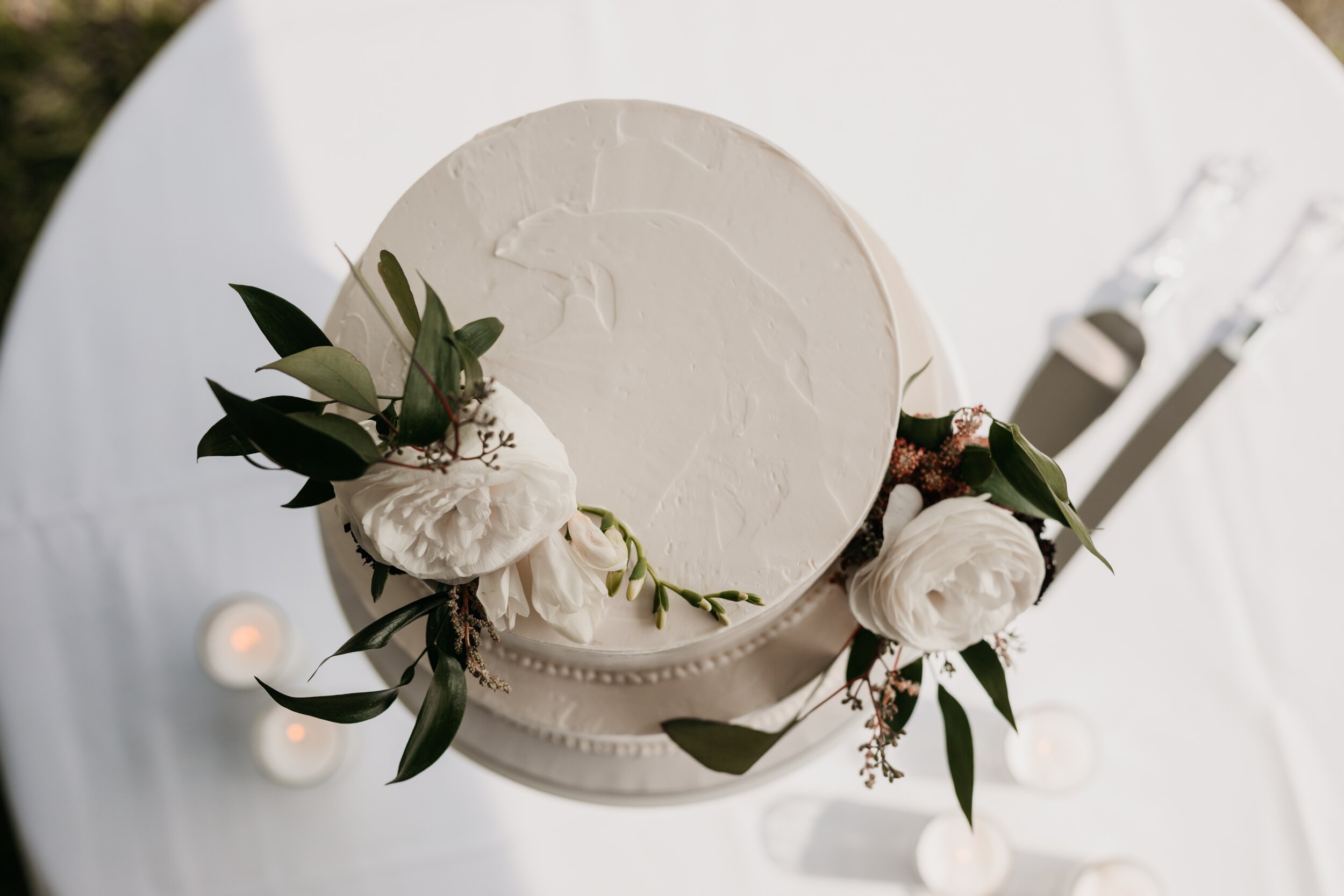
p.made baked goods is a small-batch, made from scratch bakery run by the self-taught baker, Paula Wang.
Paula needed a delicious, pretty brand identity system that could be implemented on packaging, her website, and social media posts.
Client
p.made baked goods
Services
Branding
Baking the Brand
When conceptualizing a symbol for p.made I explored many necessary tools for a baker, but I chose to focus on the whisk. Like Paula, the whisk came from humble beginnings. In fact, the first whisks were simply bundled twigs. But since then this tool has improved with multiple variations available today.
I saw a similar evolution in Paula’s journey to becoming a baker: she quit her job to attend culinary school only to learn it would be closing two weeks before the start of her program. Nonetheless, she persisted, took her education into her own hands, and now co-owns a DC bakery!
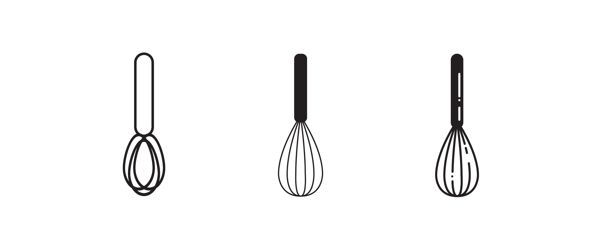
My initial concepts of the whisk.
Symbol / Logomark
Wordmark
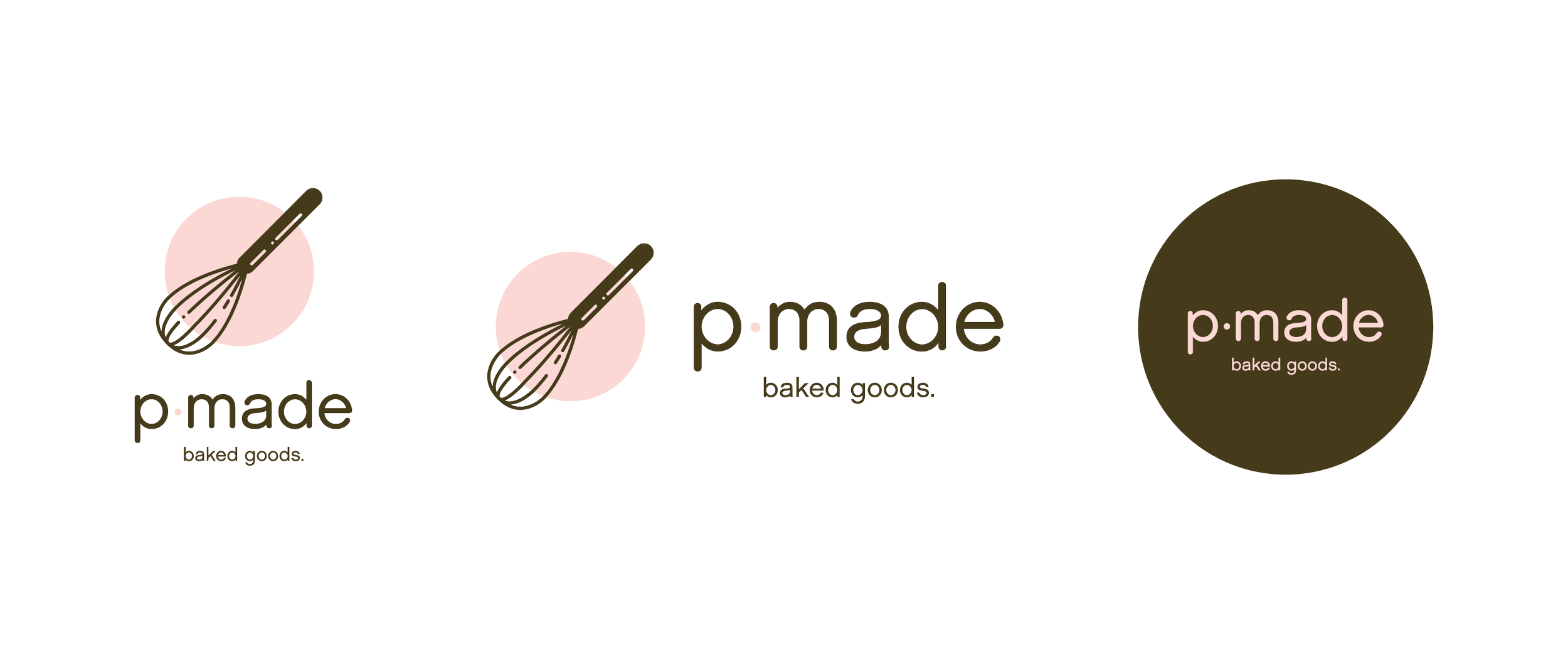
Symbol + Wordmark Combination
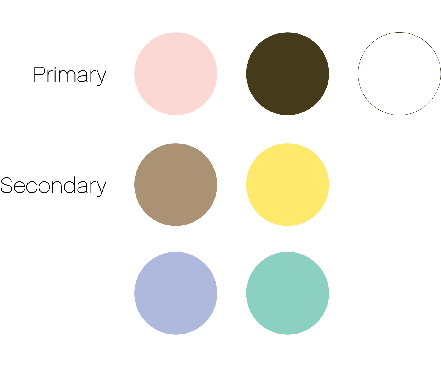
Color Palette
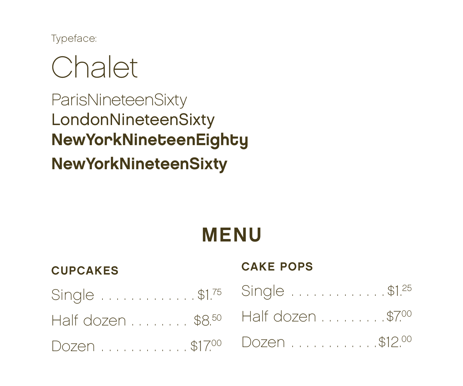
Typography
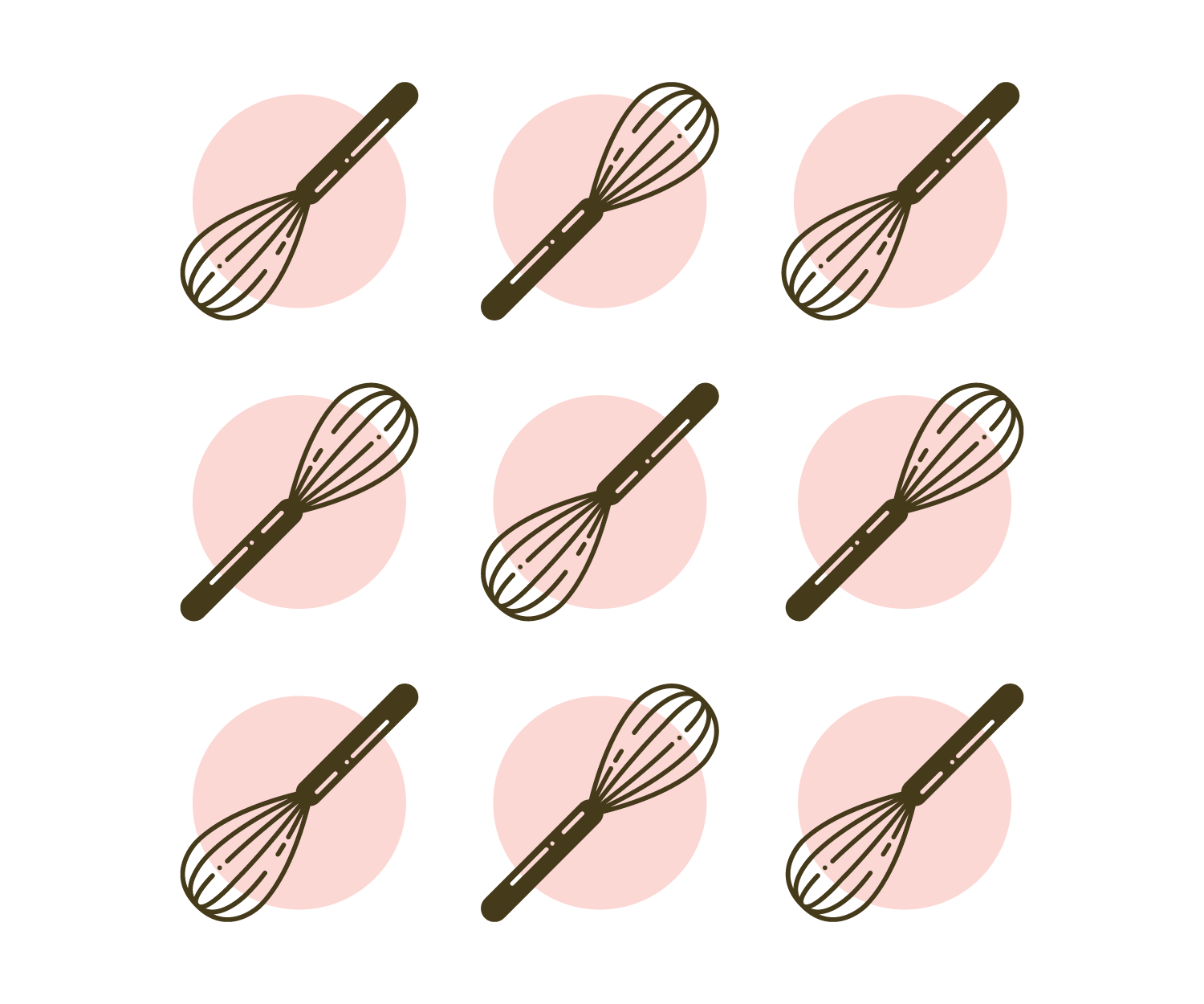
Pattern
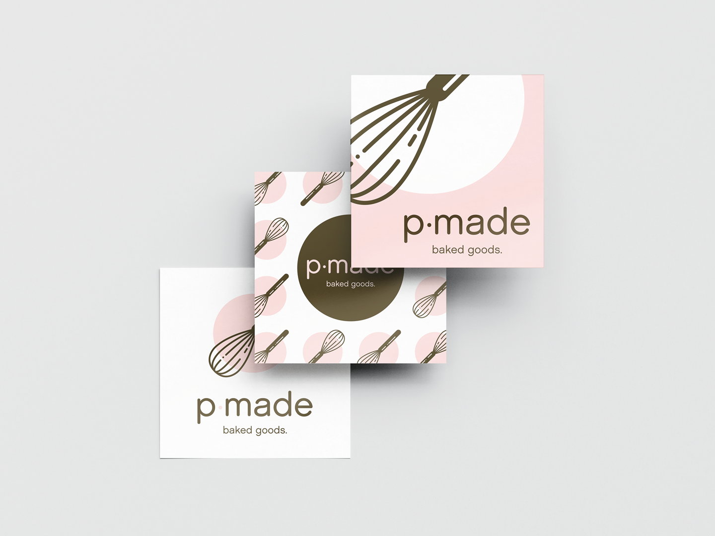
Three variations of stickers were created to personalize any generic packaging with the p.made brand.


The goal was to provide a foundation for Paula to apply her brand wherever needed as her business grows.


